Zapnito Rebrand
Making Zapnito stand out from the crowd
Crafting a bold new visual identity that distinguishes it from the competition while staying true to its enterprise ethos
Skills
- Visual Identity
- Brand Strategy
- Brand Guidelines
- Accessibility
Tools
 Figma
Figma Illustrator
 Photoshop
 InDesign
 Next.js
 Tailwind CSS
The Challenge
The community SaaS space has become very crowded in recent years and Zapnito recognised the need to differentiate itself visually to to stand out from competitors. Despite offering a distinctive product, Zapnito found its visual identity was beginning to blend in with the others in the industry. Everyone was converging on the same visual style, same imagey and even the same language.
To address this a bold new visual identity was needed, while preserving its enterprise look and feel.
The Solution
Strategic Visioning
The marketing and customer success teams engaged with customers, prospects and the wider Zapnito team to find out what makes them unique. From this, four themes emerged that would form Zapnito's brand values:
- Trusted - Zapnito brings trusted peers together to connect and help eachother succeed
- Flexible - Community builders need to be able to quicky adapt to their members' needs
- Human - Zapnito provides a very high-touch service. They're not just another platform, they're growth partners
- Impactful - Driving measurable impact is core to Zapnito's mission
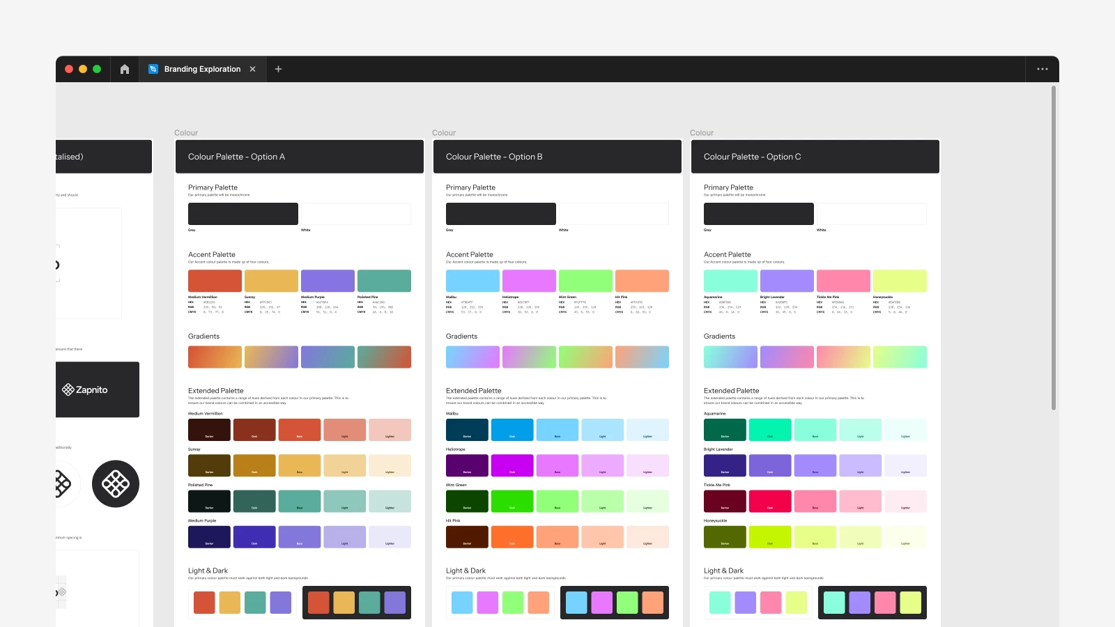
Exploration
With these brand values in place, I embarked on an exploration of bold visual elements that would set Zapnito apart from the crowd. This involved experimenting with vibrant color palettes, clear typography, and bold graphic elements to create a distinctive visual language. These options were iteratively narrowed down with key stakeholders
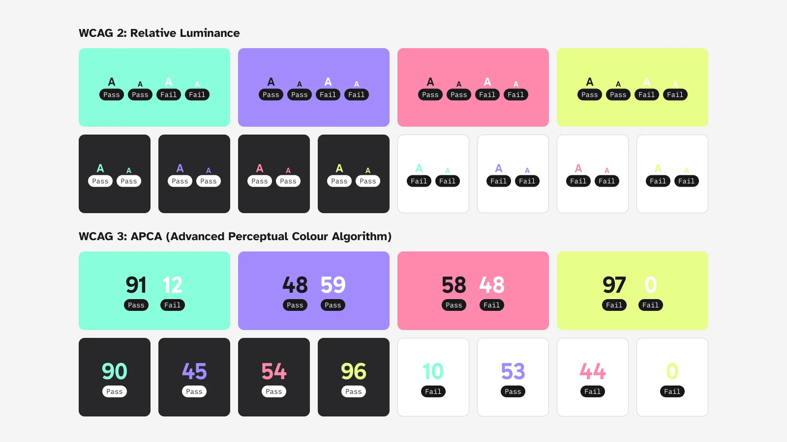
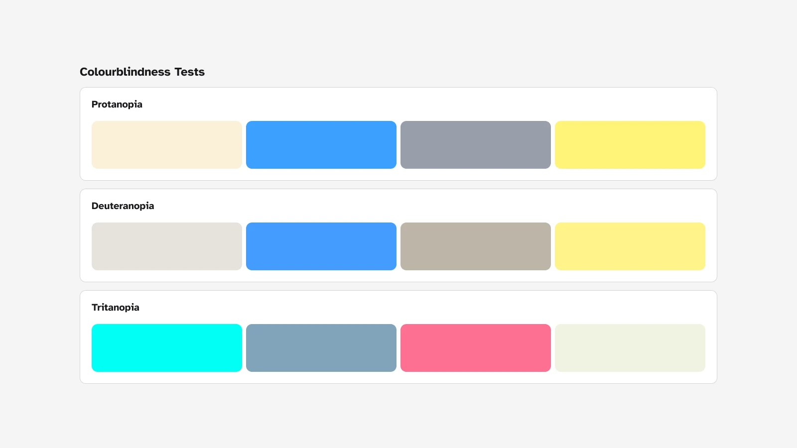
Accessibility
Accessibility was core to Zapnito's visual identity, embodying their commitment to inclusion and user-centric design and fostering trust - one of their core brand values.
Colour contrast was tested using both relative luminance (for WCAG 2) and the upcoming APCA (for WCAG 3). The results would inform how these colours should be used to ensure accessibility.
In addition, colours were tested against various types of colour blindness to ensure each are still distinguishable on their own regardless of the type of colourblindness the user may have.
Results
What resulted was a bold new rebrand in just 3 months, managed entirely in-house.
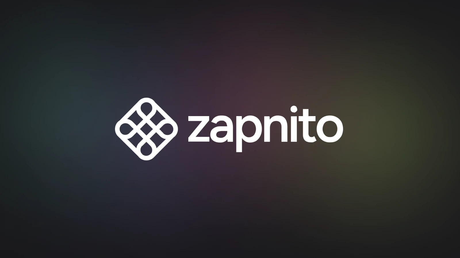
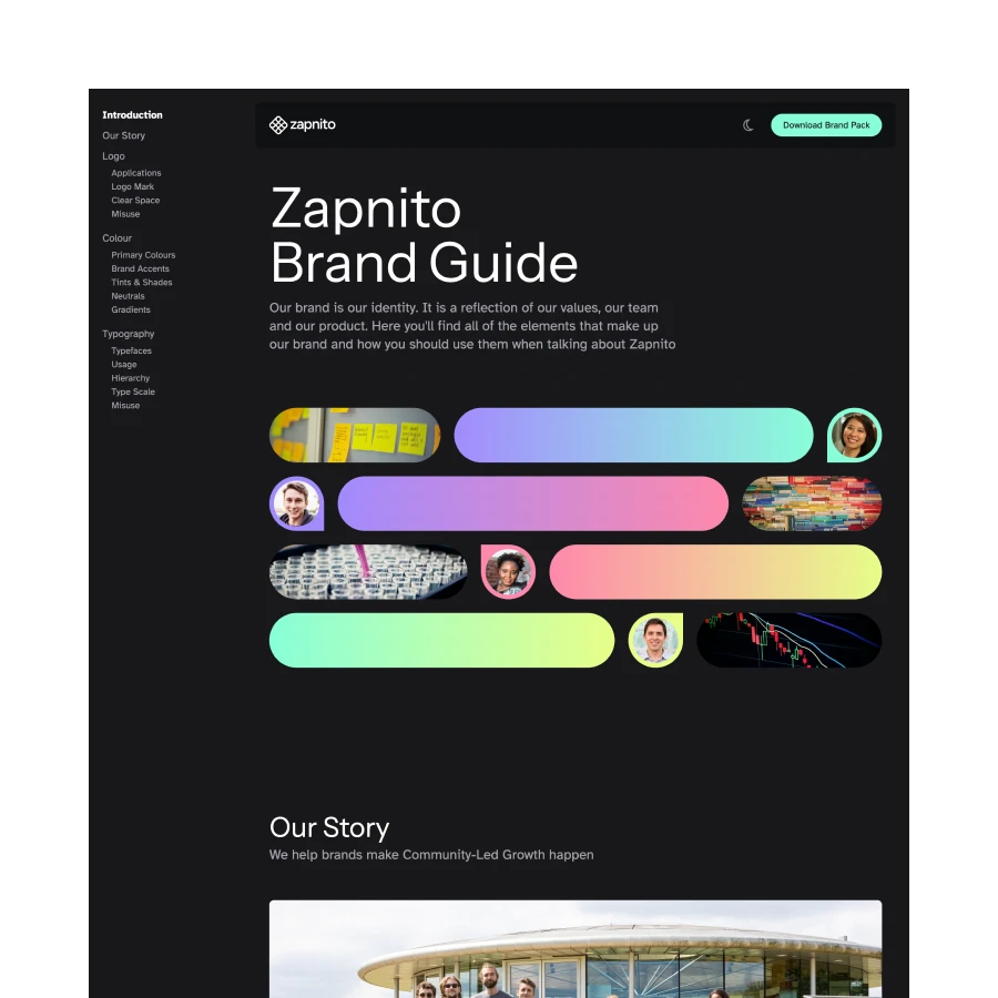
Logo
The new logomark is a simple representation of connectivity. Each side of logo connecting the pathways from the community-led growth flywheel - Acquisition to Adoption, Adoption to Retention, Retention to Advocacy, Advocacy to Acquisition.
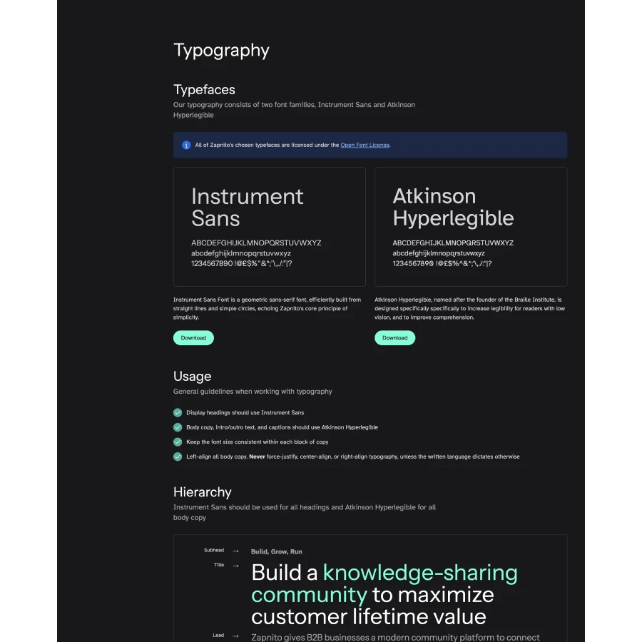
Typography
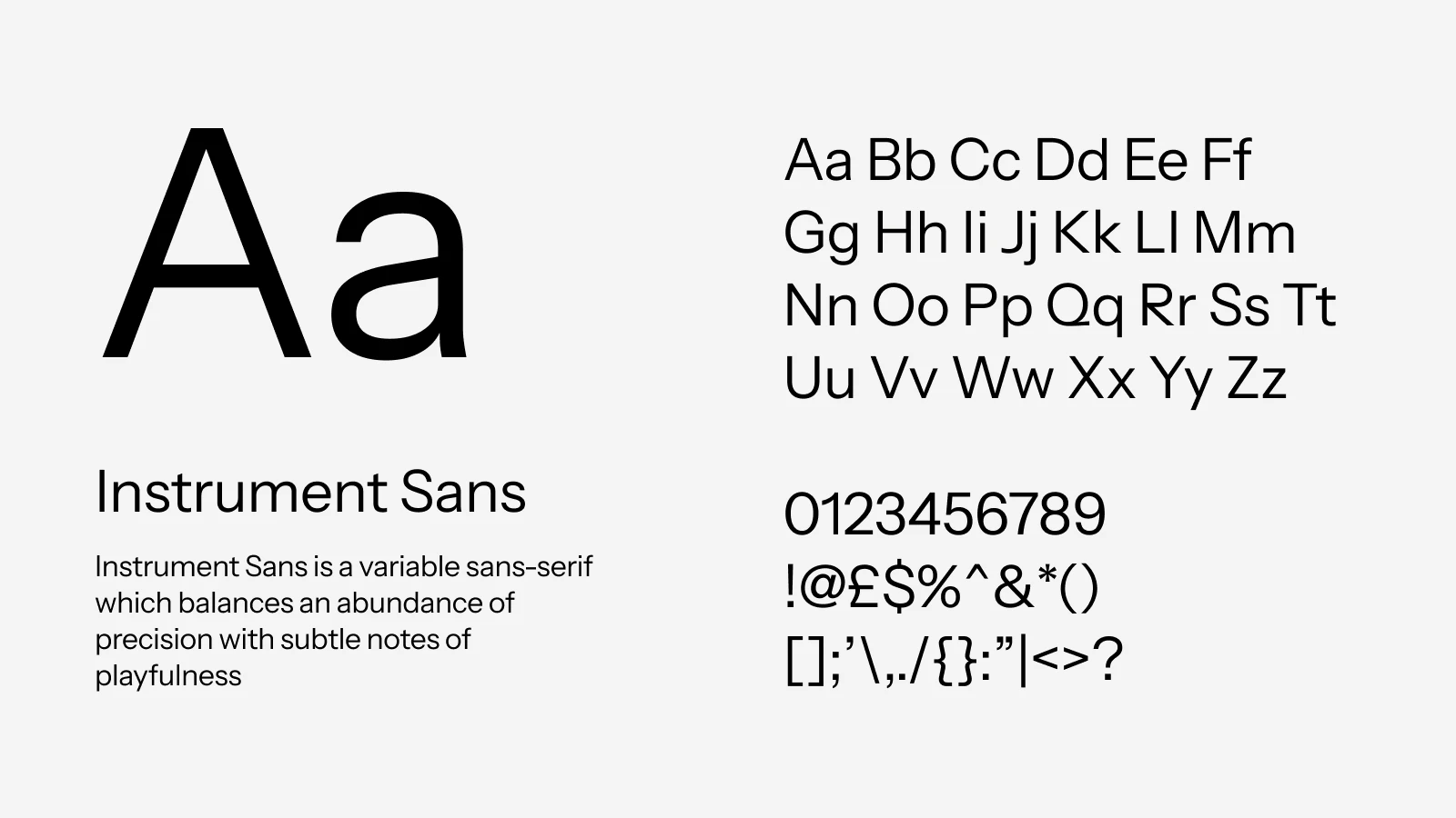
Instrument Sans was chosen as the heading typeface for its high legibility but with subtle notes of playfulness.
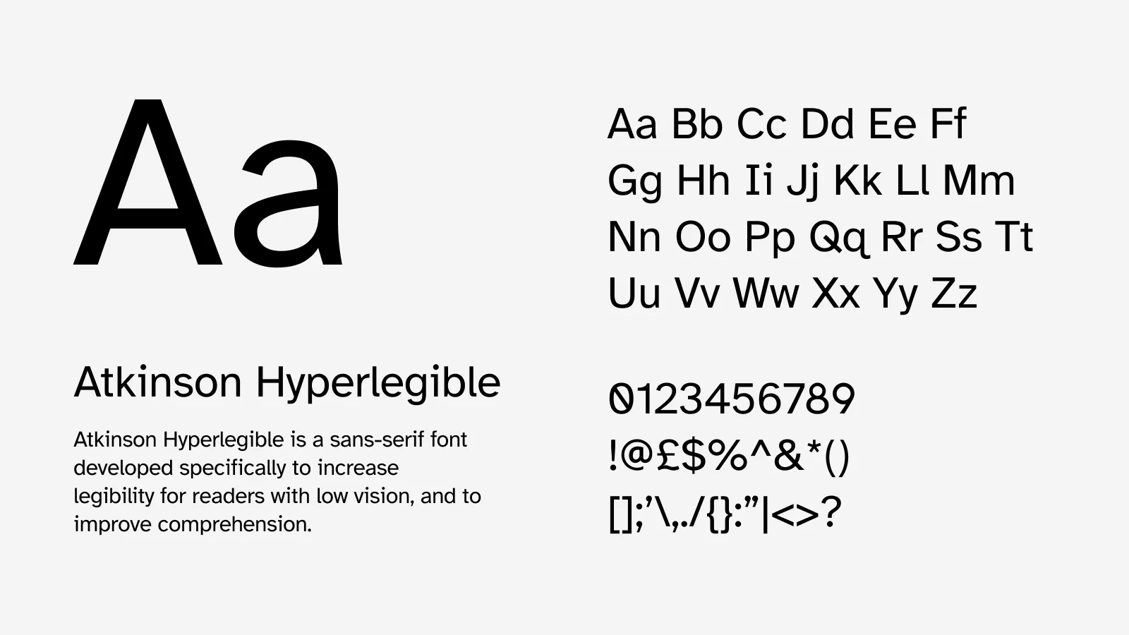
This was paired with Atkinson Hyperlegible (named after the founder of the Braille Institute, J. Robert Atkinson). This typeface is specifically designed for legibility at all sizes, focusing on letterform distinction to increase character recognition. Once again, tying into Zapnito's commitment to accessibility and trust.
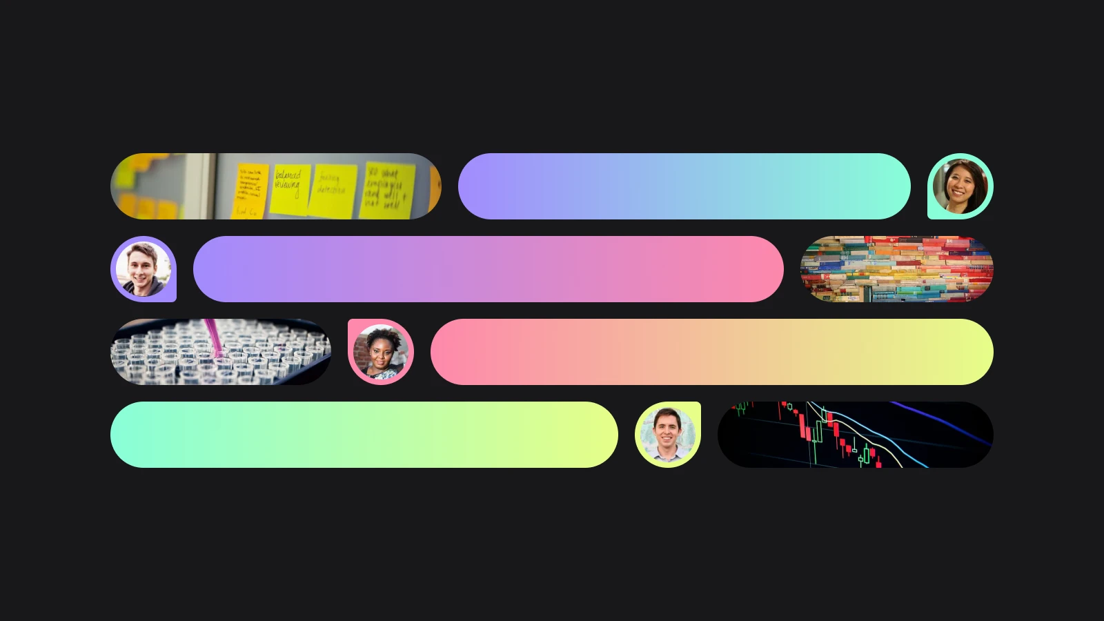
Colour Palette
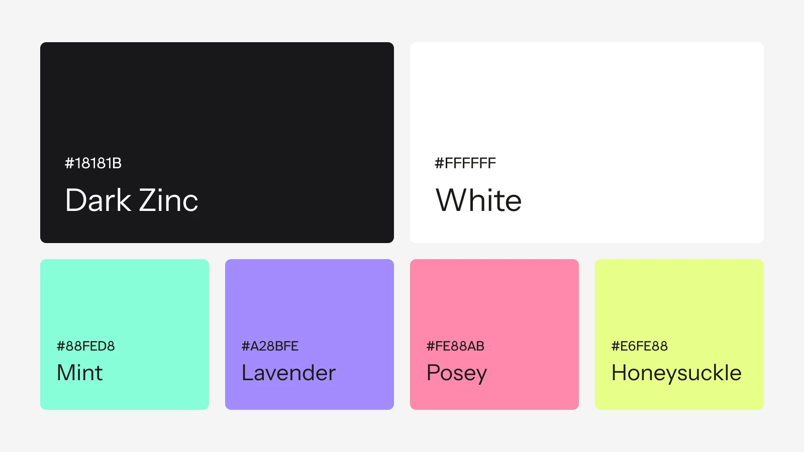
A switch from predominantly light colour scheme to predmoninanlty dark theme created fundamentally
Zapnito's primary palette is monochrome supported by four vibrant accents. Each of these colours tie back to each stage of the community-led growth flywheel.
Brand Guidelines
Brand Elements